
Tuesday, December 25, 2012
Tuesday, December 4, 2012
Local Support
As much as possible, I try to use local vendors and I try to volunteer my services as much as I can. This is one instance where I offered to create a logo for the Flemington Raritan Education Foundation. They envisioned what they wanted and after several rounds of revisions we finally came up with this one. They are working on an official website still but gave me a shout out and have information about them here http://www.frsd.k12.nj.us/domain/808


Monday, November 26, 2012
The Holidays are Here!
I get a lot of requests for holiday dinner party invitations and/or holiday cards. This is one I did for a recent bride of mine that wanted custom invitations for her dinner party. We used a gold pouchette and self-mailed them with wrap around labels. We were on a tight deadline so these did the trick!


Monday, November 12, 2012
Paperworks is Up and Running
Hurricane Sandy swept through our state of NJ and it’s going to take some to recover from this devastating storm. Luckily all we had was a loss of power for a week and no cable, internet and email for about 2 weeks. It makes you thankful for what you do have.
We want to thank all of our clients for your patience and understanding in the delay of our work. We still managed to meet our deadlines, with thanks to our friends and neighbors for their Wifis! Now it's time to catch up!
Monday, October 29, 2012
Fashion Forward
Lusmila McColl is an incredible designer and I am lucky to have created her logo and overall look for her company. She has been in fashion magazines, runway shows, well known blogs, etc. Here is an ad showcasing one of her many pieces and I am happy to get recognition in a fashion magazine!


Tuesday, October 16, 2012
A Taste of Hunterdon 2012
This is a big local event that takes place in Hunterdon County. This event is being held at the Grand Colonial Restaurant in Hampton, NJ. They hope to raise money for our neighbors in need. There will be a delicious assortment of food and amazing auction items. I was lucky enough to design the material for this event again. We chose to send out a postcard style invitation, hand out some flyers and include a tribute card. If you'd like to find out more information on the event or to purchase tickets, visit their website at www.familypromisehc.org.


Monday, October 15, 2012
Children's Art
I grew up with a father who is an amazing artist and was exposed very early with drawing on his lap. I used to go to work with him and I clearly remember drawing with magic markers while he was in meetings and using the photocopier to create unique black and white images. So to this day, with my own children it's wonderful to see the art they create. So much that I want to save everything but am accumulating too many bins full of it. These are a couple that I framed and thought so simple, yet so creative. My philosophy with everything!


The Whole Package
Ashley and Keith's wedding was full of details! We did everything from her Save the Date, Rehearsal Dinner invitation, Wedding Invitation, Programs, Wine Labels, Menus, Table Numbers, and Place cards to Thank You. She wanted everything to match and left no detail untouched. For the Programs we used a unique wood grain paper for the front and back cover and a light green twine rather than ribbons (which she did NOT want in any of her stuff). And she saw some cute Table numbers and wanted to replicate them using their photos and the year from which they were taken as the table number itself. A great personal touch!


Saturday, September 22, 2012
Baby Shower: Owl theme
Seasha is having her first baby and does not know if it's going to be a boy or a girl. She also LOVES owls and her sister wanted to reflect that in a simple, muted, elegant baby shower invitation. So we designed the invitation in natural colors and printed on a shimmery metallic linen texture paper. Matching envelopes and soap labels were also part of the set.


Friday, September 14, 2012
Rehearsal Dinner Invitation
Ashley asked us to create a rehearsal dinner invitation reflecting the look of her invitation suite we custom designed. She decided to have it at one of our favorite local restaurants, Matt's Red Rooster and we had to come up with something creative for it. As I cracked myself up thinking of rooster sayings, this is what I came up with. The invitation is printed on a white linen metallic paper, enclosed in chocolate brown envelopes and sealed with a custom wraparound address label.


Tuesday, August 7, 2012
Hello Kitty
Hello Kitty is huge over here at Paperworks Design Studio, many requests for this cute cat. Here is one we did for a fourth birthday party. So cute, and we also have matching favor bag labels, thank you cards and cupcake tags to match.


Tuesday, July 31, 2012
Client Testimonials
It's always nice to hear back from clients, especially the newlyweds. We are so appreciative to get so many thank you cards and emails. I just wanted to share two that recently came in the mail. And they are both friends that referred each other which seems to be the best form of advertising!
Thank you so much for all the work you did for our wedding. Your work is amazing and flawless. I can't wait for everyone to see it all at our wedding this weekend. We will absolutely be contacting you again in the future for announcements, invitations, etc.
Erin & Robert
And another:
I just wanted to thank you for all your beautiful work you did for our wedding. Your invitations, place cards, shower invites and thank yous were exactly what I wanted! I received so many compliments on everything. You were a pleasure to work with - so efficient and pleasant! Thanks again!
John & Leslie
Monday, July 16, 2012
Cool in Copper
We promised you we'd show you the invitation to match the Pocket Sleeve Save the Date we blogged about earlier. Well, here it is, complete and delivered. Ashley was so indecisive at first but with a couple rounds of ideas and color choices, she was thrilled with the way they came out. We were too! We tried out a new shimmery linen paper stock to add some fanciness which really brought out the floral design. Layered with a chocolate brown card stock and using fall colors, this invitation really reflects the environment that the event is taking place in. Take a look and you'll see what we're talking about. We can't wait to do the Menus, Placecards and Programs to match but fitting in the woodgrain chocolate paper stock to add some more texture.


Wednesday, June 13, 2012
Arbonne Extravaganza!
Many of my friends are selling Arbonne skincare products and have come to me to create some fabulous invitations for their events. One was during Halloween to demonstrate makeovers and how to achieve a certain look while the other was after a trip to Vegas to introduce their new line of products. You can visit their website for the variety of products they offer. http://www.arbonne.com/


Wednesday, June 6, 2012
Pocket Sleeve Save the Date
Ashley wanted wedding invitations that had that elegant affair feeling yet the soft country happy hippie look. A bit of a challenge but it all worked out in the end. You'll have to check back to see the final product of her wedding invitations. So, in reverse order, we quickly tackled her Save the Dates. She didn't want the typical ones with a photo on them or something as basic and simple as a card so I suggested telling a brief story about the couple. A great idea for those that are not as familiar with the bride or groom and something that will have their guests actually taking the time to read it. Check them out below, they were printed on a shimmery linen paper and inserted into a chocolate brown Pocket Sleeve. The colors and style reflect their wedding invitation suite that will be done soon.


Thursday, May 3, 2012
Tiny Details
If you know me well enough, I am always looking for a way to add on some kind of detail. Whether it be on typography or in a design, a rhinestone, a die cut, etc...well I found these beautiful elegant little pearls from Martha Stewart! I had to use these on the latest wedding invitations I did and they added "that simple touch" that I am always after.


Wood is Good
So I am in love with these faux wood grain pocket folds and have been using them for many samples lately. They are perfect for that rustic, chic country wedding and give a little bit of texture to the whole package. Here is one of my samples and I plan to create many more invitations using this newfound paper that comes in a couple different colors. Check it out...


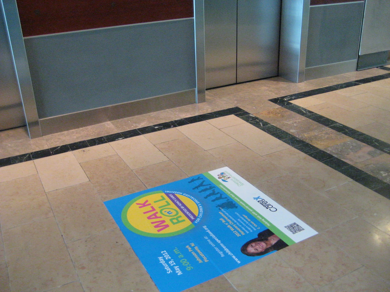
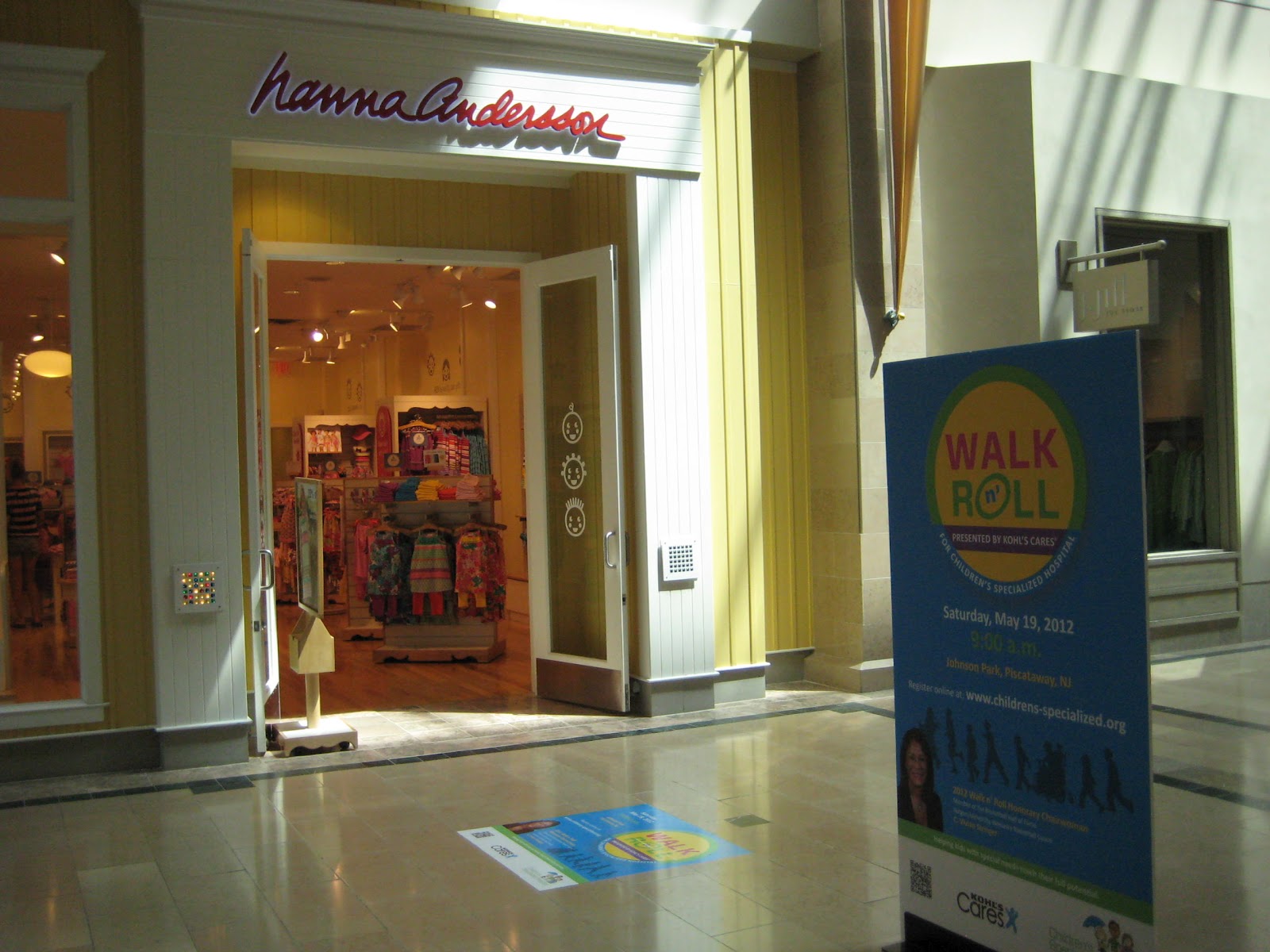
Walk n' Roll!
I do a lot of work for the Children's Specialized Hospital and they hold an event each year called the Walk n' Roll. I designed the logo for the event and all the material to promote the event. So check out these photos that are on display now until May 19th at Bridgewater Commons Mall. They look great!
For more information on this event or to register for it visit http://walknroll.kintera.org/faf/home/default.asp?ievent=1005264.


For more information on this event or to register for it visit http://walknroll.kintera.org/faf/home/default.asp?ievent=1005264.


Subscribe to:
Posts (Atom)