Wednesday, June 13, 2012

Arbonne Extravaganza!

Many of my friends are selling Arbonne skincare products and have come to me to create some fabulous invitations for their events. One was during Halloween to demonstrate makeovers and how to achieve a certain look while the other was after a trip to Vegas to introduce their new line of products. You can visit their website for the variety of products they offer. http://www.arbonne.com/


Wednesday, June 6, 2012

Pocket Sleeve Save the Date

Ashley wanted wedding invitations that had that elegant affair feeling yet the soft country happy hippie look. A bit of a challenge but it all worked out in the end. You'll have to check back to see the final product of her wedding invitations. So, in reverse order, we quickly tackled her Save the Dates. She didn't want the typical ones with a photo on them or something as basic and simple as a card so I suggested telling a brief story about the couple. A great idea for those that are not as familiar with the bride or groom and something that will have their guests actually taking the time to read it. Check them out below, they were printed on a shimmery linen paper and inserted into a chocolate brown Pocket Sleeve. The colors and style reflect their wedding invitation suite that will be done soon.


Thursday, May 3, 2012

Tiny Details

If you know me well enough, I am always looking for a way to add on some kind of detail. Whether it be on typography or in a design, a rhinestone, a die cut, etc...well I found these beautiful elegant little pearls from Martha Stewart! I had to use these on the latest wedding invitations I did and they added "that simple touch" that I am always after.


Wood is Good

So I am in love with these faux wood grain pocket folds and have been using them for many samples lately. They are perfect for that rustic, chic country wedding and give a little bit of texture to the whole package. Here is one of my samples and I plan to create many more invitations using this newfound paper that comes in a couple different colors. Check it out...


Walk n' Roll!

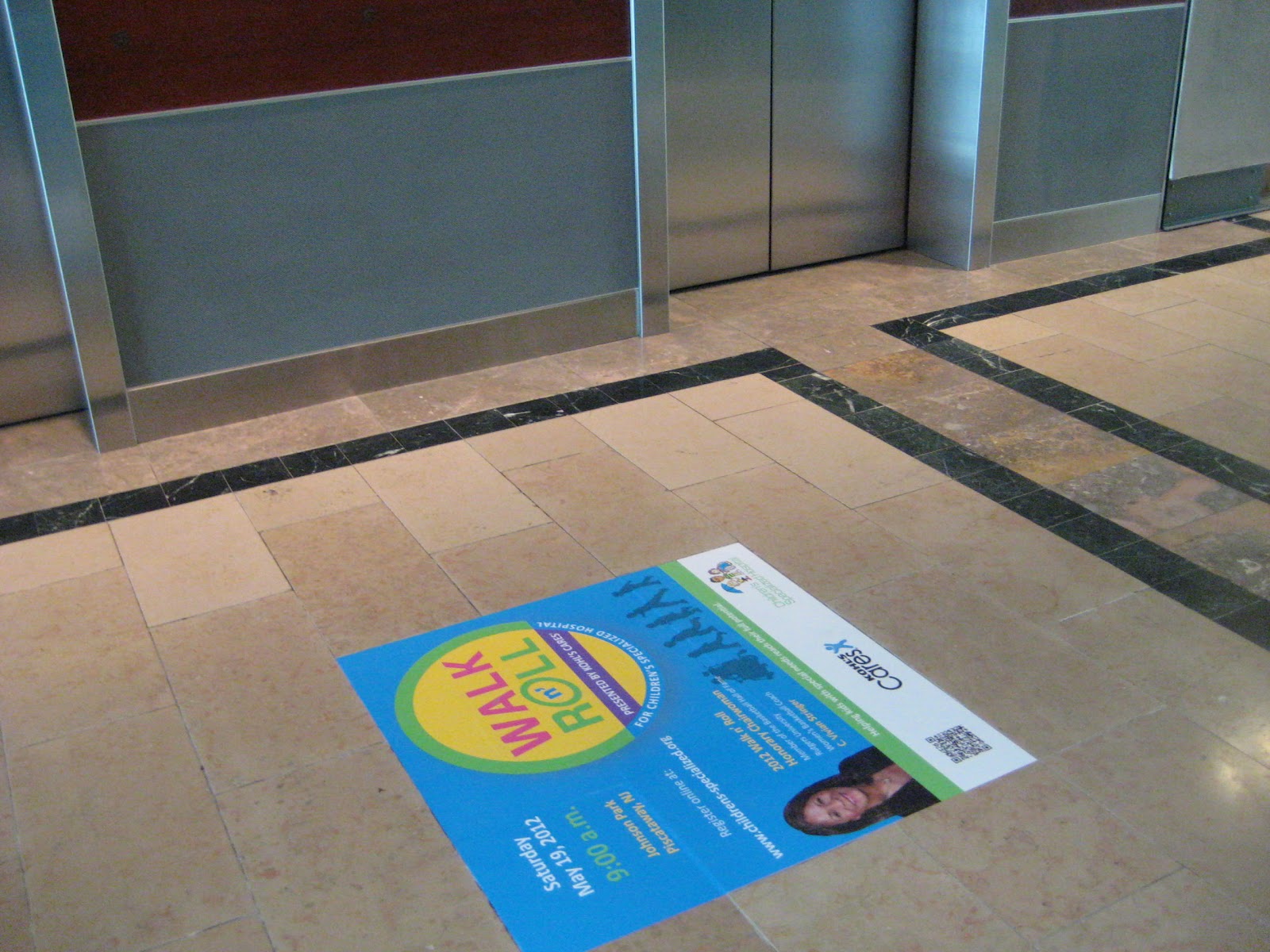
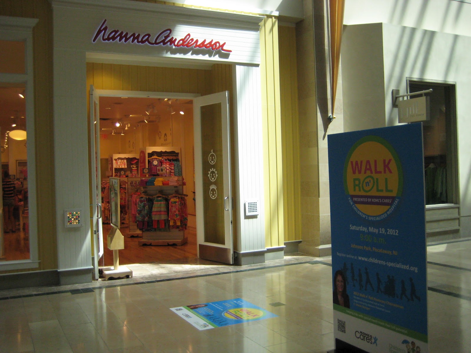
I do a lot of work for the Children's Specialized Hospital and they hold an event each year called the Walk n' Roll. I designed the logo for the event and all the material to promote the event. So check out these photos that are on display now until May 19th at Bridgewater Commons Mall. They look great!

For more information on this event or to register for it visit http://walknroll.kintera.org/faf/home/default.asp?ievent=1005264.


Monday, April 9, 2012

Packaging and Favors

There's nothing like making your own favors, that's if you have the time! These cookies were customized for a 60th birthday party (thanks to etsy) but a friend of mine wanted to package them to match the color and theme of the party so with my help I made labels for the top of the boxes with her mom's initial to match the invitation set she had gotten from Michaels. She loved the design so much that she added it to the Menus! Check out how pretty they came out.


Tuesday, April 3, 2012

It's all about the color combination

The latest wedding package we put together was so much fun to work on. A nice triple layered bright pink and turquoise color combination printed on a shimmery white paper stock. The package included Save the Dates, Wedding Invitation and thrown into the mix, a Program, Thank You card, and Placecard. Using the red and white baker's twine is my new love and I try to throw it into any design I can. For this, it worked out perfectly matching the pixie stick pattern on the belly band and tying everything together.